

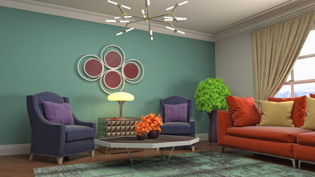
Colour is the fastest way to change how a room feels, and nowhere does it matter more than the space where you relax and entertain. The right wall colour combinations for living room settings can make a small flat feel bigger, a dull room feel warm, and a plain hall feel genuinely designed. In Indian homes, where living rooms often flow into the dining area and get plenty of natural light, colour choices carry even more weight. At Imperium Spaces, we help homeowners pick shades that suit their space and lighting every week, so here are the combinations that consistently look beautiful, along with tips to choose the right one for your home.
Why Wall Colour Sets the Mood of Your Living Room
The walls make up the largest visible surface in any room, so their colour shapes the entire mood before the furniture even comes in. A soft, light palette makes a space feel open and calm, while deeper tones add warmth and drama. Colour also affects how big a room feels, how well it handles natural light, and how your furniture and décor stand out. Getting the wall colour combinations right early saves you from a room that feels off no matter how good the furniture is. It is the foundation every other design choice builds on.
Best Wall Colour Combinations for Living Room Spaces
The best combinations pair a calm base with a thoughtful accent. These are the wall colour combinations for living room settings that work beautifully in Indian homes, whatever your style.
Step 1: Warm White and Beige
This timeless pairing suits almost every home. Warm white on most walls with a beige or sand accent wall creates a soft, inviting backdrop that never dates. It reflects natural light beautifully, makes compact living rooms feel larger, and lets your furniture and art take centre stage. It is the safest, most versatile choice for Indian homes.
Step 2: Grey and White
For a modern, elegant look, pair soft grey with crisp white. Grey brings a contemporary edge while white keeps the room fresh and open. This combination works especially well in open-plan flats and pairs perfectly with wooden furniture and metallic accents. Keep the grey light in smaller rooms so the space stays airy.
Step 3: Earthy Terracotta and Cream
If you want warmth and character, an earthy terracotta or rust accent against a cream base feels rich and welcoming. This palette adds an Indian, grounded feel that suits homes with wooden furniture and natural textures. Use the bold shade on one wall only, so it adds warmth without overwhelming the room.
Step 4: Soft Green and Off-White
A muted sage or olive green with an off-white base brings a calm, nature-inspired feel that is very much in style. Green works wonderfully in living rooms because it feels restful and pairs beautifully with indoor plants and wooden tones. It suits homes that want a fresh, relaxed atmosphere without going too bold.
Step 5: Navy Blue and White
For homeowners who want a statement, a deep navy accent wall against white creates striking, sophisticated contrast. Navy adds depth and a premium feel, especially behind a sofa or a TV unit. Balance it with plenty of white and good lighting so the room feels rich rather than dark, particularly in smaller spaces.
How to Choose the Right Colour for Your Space
The perfect palette depends on your specific room. Consider how much natural light you get, since bright rooms handle deeper shades well while darker rooms need lighter tones to stay open. Think about the size, as light colours expand a small living room and bold accents suit larger spaces. Match the palette to your furniture and flooring so everything works together. Test samples on the actual wall before committing, because colours shift dramatically under different lighting. For the full picture of pulling a room together, our guide to living room interior design in Bangalore covers focal points, lighting, and layout alongside colour.
Common Colour Mistakes to Avoid
A few simple errors can undo an otherwise good palette. Using too many bold colours at once makes a room feel busy and restless, so limit yourself to one or two accents. Ignoring your lighting is another common slip, since a shade that looks great in the showroom can feel harsh at home. Painting every wall the same flat colour makes a room feel one-dimensional, while forgetting to match the ceiling and trim can throw the whole look off. Choosing colours without considering the furniture is the biggest mistake of all. For fresh, current inspiration before you decide, design platforms like Architectural Digest India are a great place to explore.
How Imperium Spaces Gets Your Colours Right
At Imperium Spaces, we choose colours based on your room size, lighting, furniture, and the mood you want, not just what looks good on a chart. Our team visualises the full palette in 3D before any paint is chosen, so you see exactly how the wall colour combinations for living room will look in your actual home. If you are planning the whole space, our guide to complete home interior design in Bangalore ties colour, layout, and finishes together, and you can browse our completed projects to see these palettes in real homes.
Final Thoughts on Wall Colour Combinations for Living Rooms
The right colour transforms a living room more than any single piece of furniture. The best wall colour combinations for living room spaces pair a calm base with one thoughtful accent, chosen to suit your light, your size, and your style. Whether you love timeless warm whites or a bold navy statement, the key is balance and good lighting. If you would like expert help choosing the perfect palette for your home, book a free consultation with Imperium Spaces and we will bring your living room to life.